
Three color palettes I’m obsessed with recently
(Feel totally free to steal them for your brand)
I put together all the color combinations I’ve been in love with in the last few months, and I’m giving them to you to use for your next project, a brand redesign, or a new website.
We have a mix of trend queens and timeless classics here. They all have contrasting colors, which are checked for accessibility. Go ahead, find your favorite and be sure to save it to your Pinterest inspo board! (You’re gonna need it, hehe.)
(01)
Let’s start with the absolute classic of this season. Butter yellow, sky blue, and chocolate brown. I don’t care if it’s everywhere; I’m obsessed with it, and I can’t (and won’t) stop talking about it. It’s fun, it’s playful, and it’s STUNNING.
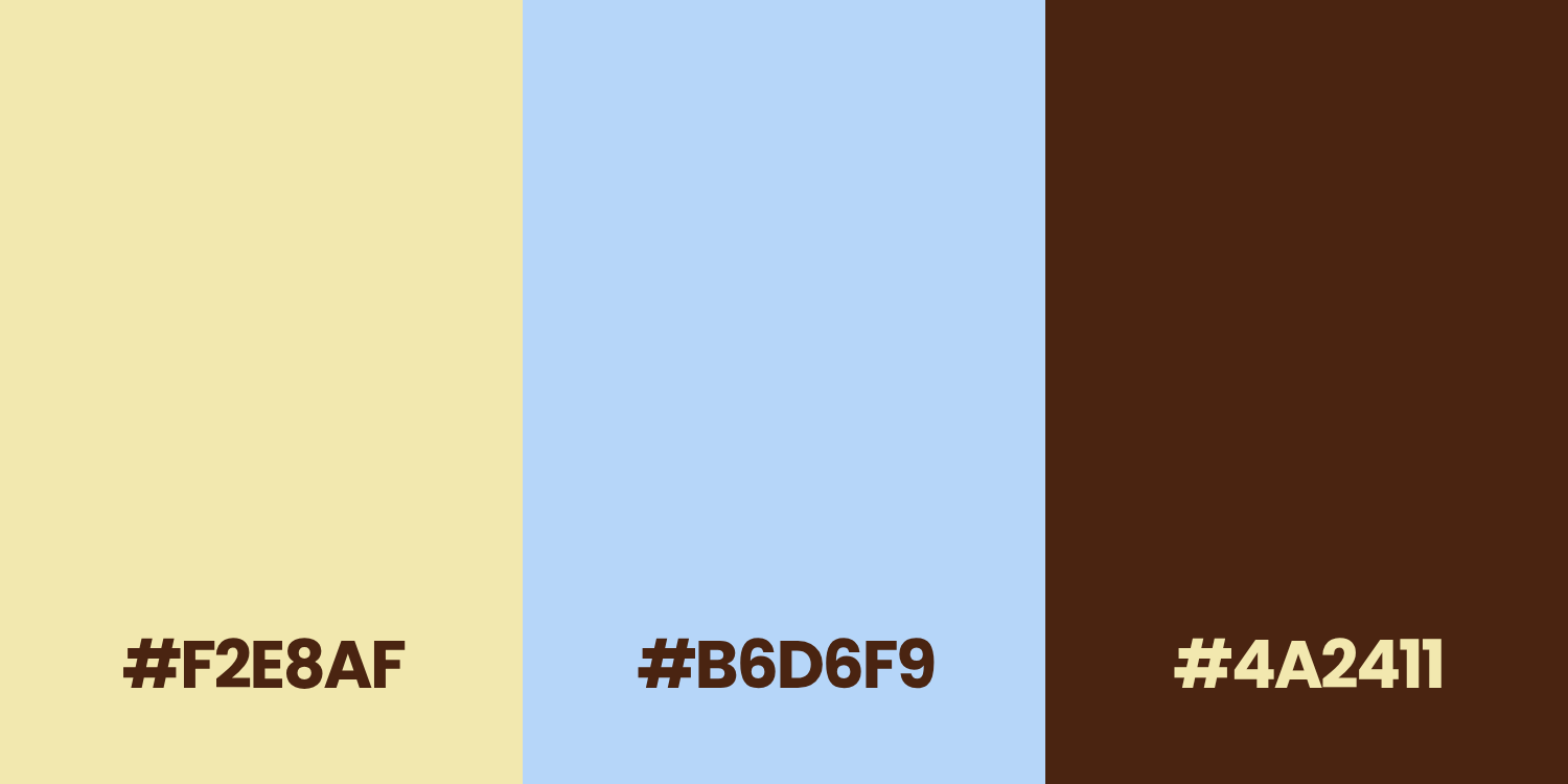
Perfect for:
Modern, playful brands that aren’t afraid of colors. Think cosmetics, food, and all the industries where you want your packaging to stand out. If your target audience is Gen Z, that’s your go-to! For websites, I love seeing this combination on portfolio websites (designers, social media managers, all the marketing girlies).
(02)
Now for something a little more timeless, though still trendy. The burgundy and olive green combination is an all-time classic. Premium and luxurious, while keeping a personality and not settling for beige minimalism. This palette is like wine to me. It’s great now, it’s gonna be even better in five years.
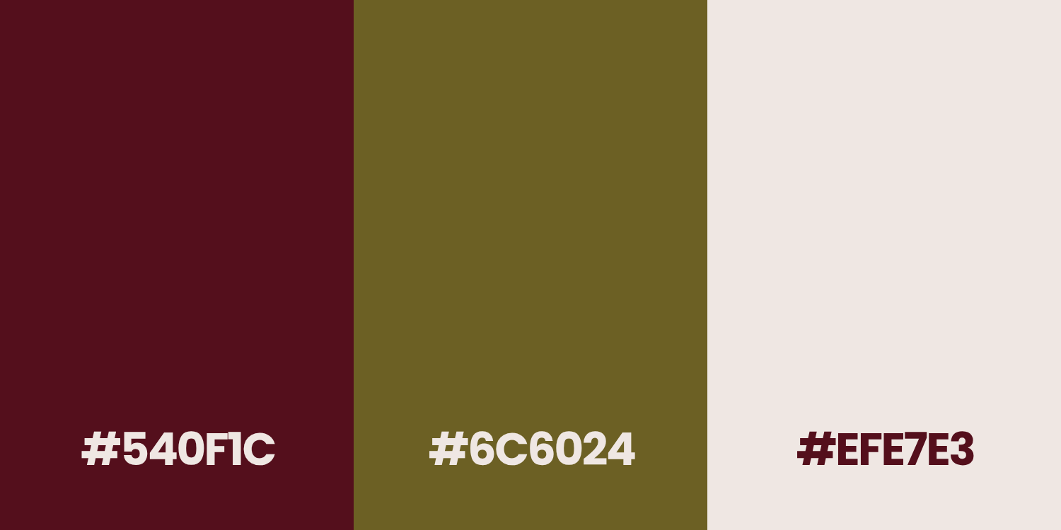
Perfect for:
The brands that feel premium and high-end. For some reason, I love this combination for everything related to interiors: designers, architects, furniture/decor brands. Hotels and hospitality (imagine that for the website of your Airbnb).
It’s also great for coaches and all types of business support services (project managers, operations managers, business analysts, etc.) that don’t want to end up with the same corporate freaking blue as literally everyone. It feels bold but calming. Mature and powerful. Ahh, I’m obsessed with it.
(03)
This is my interpretation of the gazillions of corporate websites that use a dark blue and white combination. The deep cobalt, the warm beige instead of white, and the light brown to add some personality - again, OBSESSED. This is my reminder that your business can be serious AND inviting at the same time.
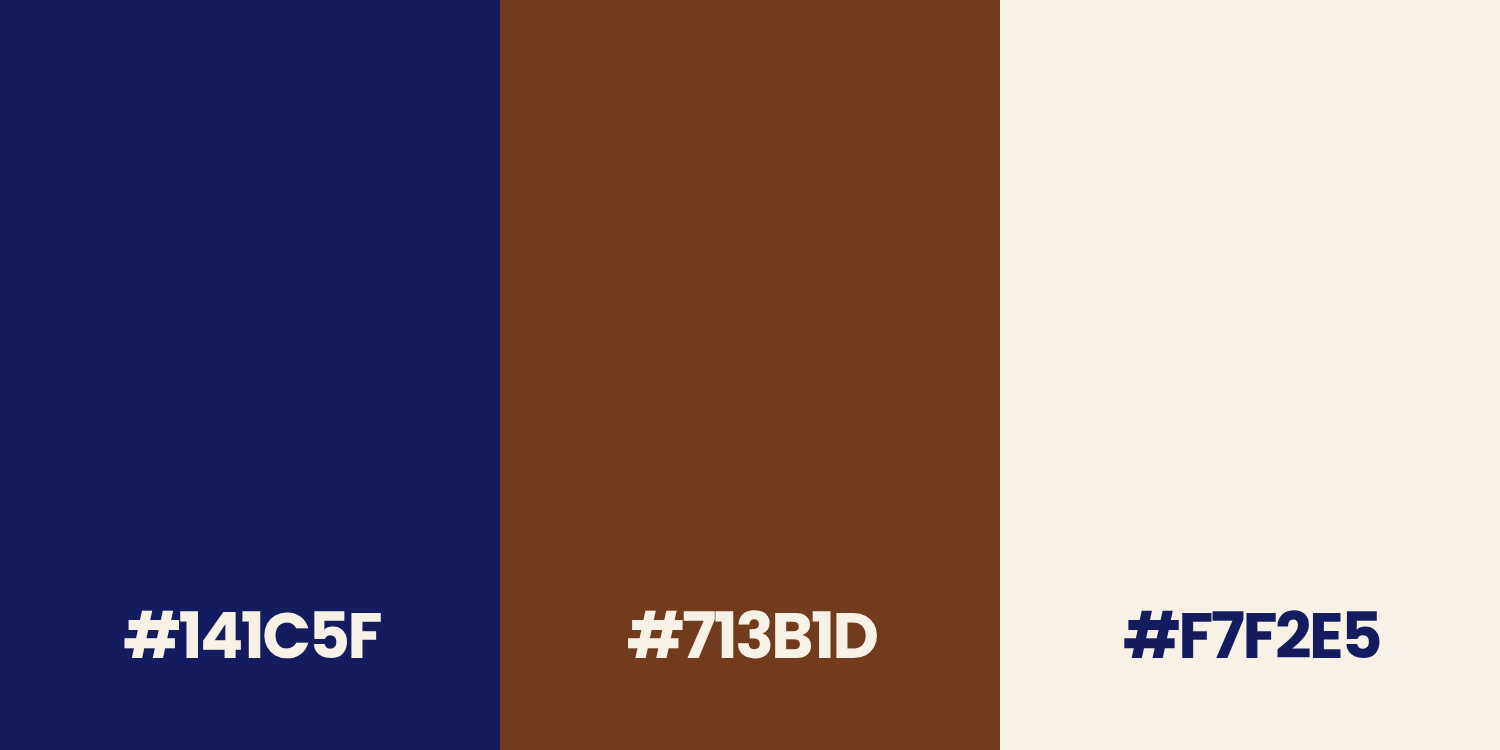
Perfect for:
All the “serious” businesses (finance, banking, big projects) that want to let their customer know that there are actual people behind them, not just computers and Excel sheets.
Wanna apply any of those to your future website?
Check my services here, and let’s do it!